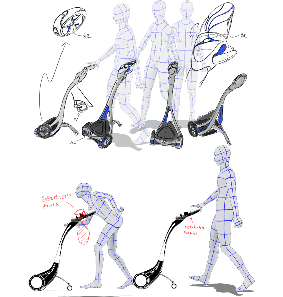
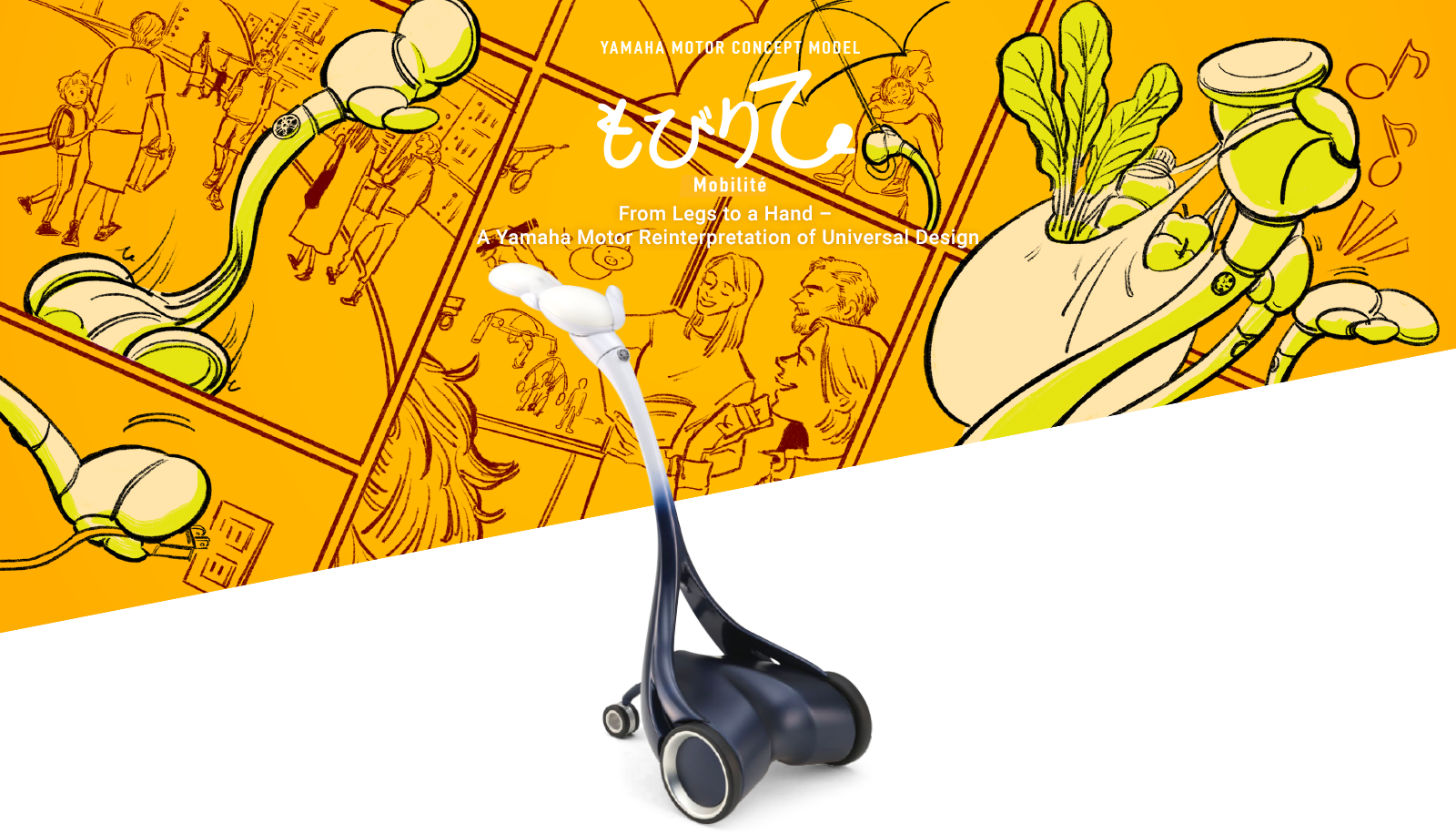
What in the world is this contraption? The round white hand gentle to the touch slowly opens; the sight of it taking someone’s hand and then slowly moving forward with them at a slow walking pace is reminiscent of a caregiver lending a close and supportive hand.
When people first see the Mobilité, they often look quite puzzled. It’s because they have never seen something that looks or moves like this, nor have they fully grasped what its uses could be.
The Mobilité is a creation from young designers that will build the next generation of Yamaha Motor design. It is a product of a program to deepen and sharpen the way we think about what an innovative, uniquely Yamaha design should be, and the designers worked as a team on everything from the initial planning and proposals to the PR approach for the final concept model. The theme the project took on was Universal Design (UD).
This term refers to designs of products, services and environments that can be used by anyone, regardless of age or gender, whether they have disabilities or not and whatever their culture, language or nationality might be, and has seven overarching principles to help guide design work to that end. So, what exactly is UD in the unique style of Yamaha? The team of young designers began by reinterpreting the seven principles themselves from the standpoint of the unique style of Yamaha.
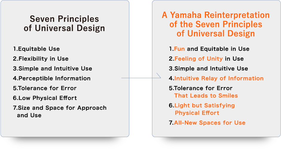

Yamaha mobility products are created to be fun to control under our Jin-Ki Kanno development ideal, which aims to deliver the seductive exhilaration felt when users truly become one with their machine. This can be considered Yamaha’s fundamental principle, that by achieving a high level of unity between the user and the machine, we can create real sources of joy and excitement for people. And accordingly, this ideal is clearly reflected in Yamaha’s approach to the seven principles of universal design. Just as our motorcycles are forms of personal mobility with a heavy recreational focus and require more physical interaction, the same values we instill in them of fun, user-machine unity and comfort must be retained in forms of mobility meant for easy use by anybody—a uniquely Yamaha perspective. In short, the young designers decided to take on the challenge of creating an all-new form of mobility adhering to universal design principles that would not only make things easier (raku) for users, but also allowing them to have fun and enjoy it (tanoshisa).
What is a fun form of mobility that gives anyone a chance to easily experience Yamaha’s ideals and sense of aesthetics? In drawing up product proposals, the young design team began by brainstorming the various factors and aspects that accompany the act of moving from one place to another, and then tried a two-pronged approach of minimizing the negative ones while maximizing the positive ones. For example, the negative aspects of operation like a complicated user interface or a difficult control scheme were avoided in favor of more intuitive operation to move around and thus contribute to “ease of use.”
With the possibility of injury to the user or surrounding people existing in cases like traffic accidents, using soft, comfortable materials never employed before in the mobility industry for the machine’s body and devising a creative construction could bring greater peace of mind and safety for users as well. And to make the connection between the machine and user closer and more profound, there should be features enabling communication that “connects” the two. Finally, to increase fun in use, the Yamaha brand’s roots in musical instruments could be drawn on to produce a sound for this new form of mobility that is also pleasing to the ear, much like an engine or electric motor can be.

context of mobility and gave serious thought to functions that were quite eccentric in nature. But this helped sharpen and develop their ideas for innovative mobility adhering to the seven principles of universal design with a uniquely Yamaha approach.
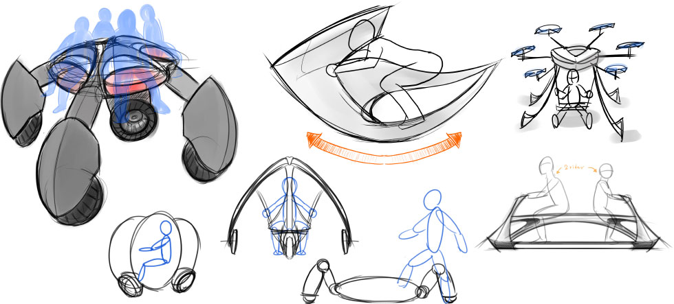

Serious discussion and consideration of ideas—some of which were rather bizarre—finally led the young design team to propose a unique form of mobility unlike any to date. Personal mobility has progressed by building machines and devices that took the place of people’s legs in order to get them where they wanted to go faster and in greater comfort. But the concept this time instead focuses on the hand, seeking to reach out to people in need and aid them not just physically but emotionally as well. Furthermore, it isn’t meant to be ridden; it facilitates mobility by staying close to people, extending a helping hand to those who need support, leading people to where they want to go, or carrying belongings.
The designers had looked at it from a different angle: “For people to whom common forms of mobility aren’t very feasible or actually entirely unfeasible, like infants, children, the elderly, or people with disabilities or injuries, maybe they actually need a hand more than legs to go places.” Theirs was a proposal of a new kind of value in mobility that they arrived at by thinking out of the box to answer the question, “What is it that people in need of universal design really want?”
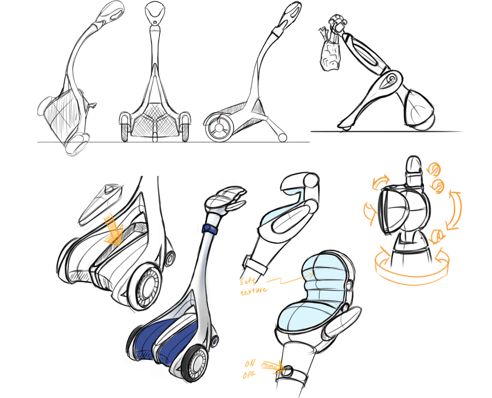
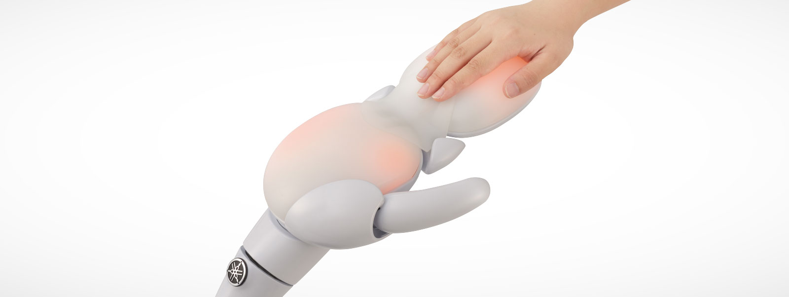
The Mobilité’s form has a “once you’ve seen it, you’ll never forget it” level of visual impact. It is also the result of a pursuit to create something that is not only easy to use but also easy to bond with from the standpoint of universal design. The design team had one firm commitment: do not make styling the purpose of the design. The goal was not to include vogue touches simply to inspire pride of ownership or to come up with something cool that looks super-fast. Rather, they sought to create the form directly from the machine’s essential functions so that the user would intuitively know how to use it while also experiencing a feeling of familiarity with the machine.
Each and every function was reviewed at length, revising them as needed so that anyone could use them—the machine perspective—and looking for what would bring personal familiarity and warmth to the relationship between it and the user—the emotion perspective. It is from these two perspectives that the designers brought together the qualities of being easy to use and easy to bond with. They had a key Japanese word to guide them: buchaiku (“kind of ugly but adorable” as if spoken by a toddler). Encapsulating this is the simplicity of the easy-to-use interface, the hand made of soft material that encourages you to reach out to hold it and an endearingly plump shape that makes the trip together from place to place fun. It was the extensive thought from the perspective of universal design and the unique style of Yamaha that led to the birth of the Mobilité’s unique buchaiku form.
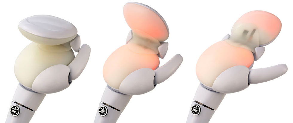
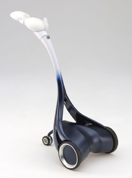
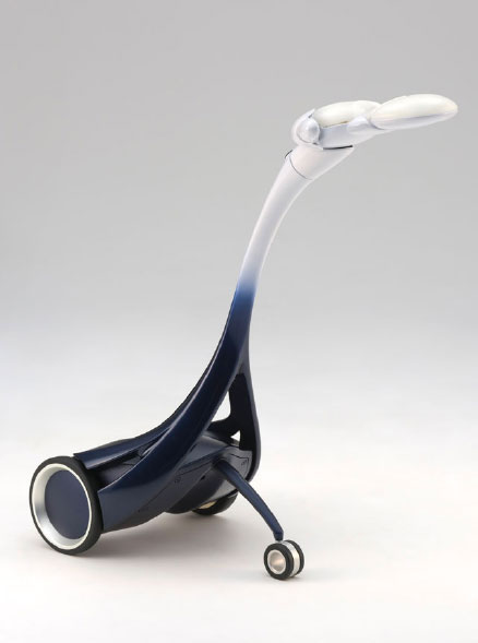
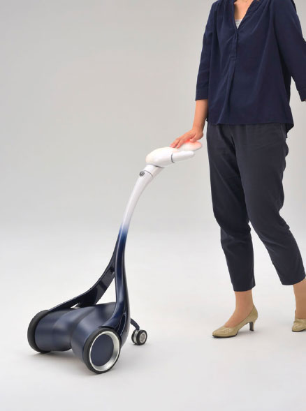
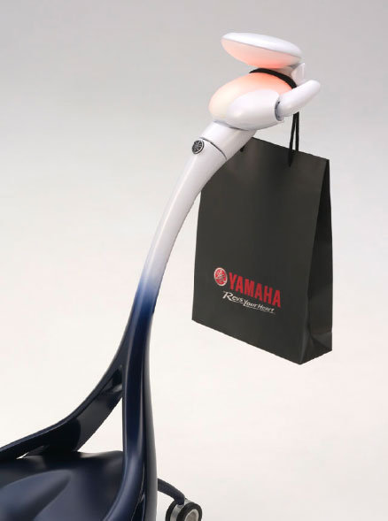
And so the Mobilité was born as a non-ridable form of mobility based on universal design that shifts the focus from our legs to the hand, featuring an eye-catching form and an all-new function to extend that hand to people in need. The possibilities for the hand’s functionality go beyond only helping support a person’s stability, like forms of assistance for escorting people, carrying belongings or an umbrella and more.
Mobilité’s form and functions are the product of the young Yamaha designers’ unwavering quest to bring mobility closer to countless people—regardless of their age or gender—and thereby make moving from place to place easier and more fun. What’s more, the team gave serious thought and stuck to the unconventional and even eccentric idea that what many people needed were not legs for mobility but a helpful hand, incorporated their own interpretation of the ideals behind universal design, and took their ideas to completion as a concept model. We believe that this very process represents an exceptionally Yamaha-like approach, even for the trial program they were working under.
“Can I give you a hand?”
For users whom we have yet to bring Kando to through our other mobility products, this simple offer may someday be what leads them to their first experience of what drives us at Yamaha.
